EduViewz has been developed to give educational institutions insight into the data that is already available within educational institutions. By displaying this data clearly, visually and interactively, the requested data can be viewed, interpreted and analyzed in an accessible way. Because the data in EduViewz is always available, a comparison can always be made with historical data. Ultimately, it is even possible to make predictions for the future based on the historical data. EduViewz is available in Dutch, English and German.
EduViewz displays data in various dashboards. In the coming period we will introduce you to the different parts by means of articles.
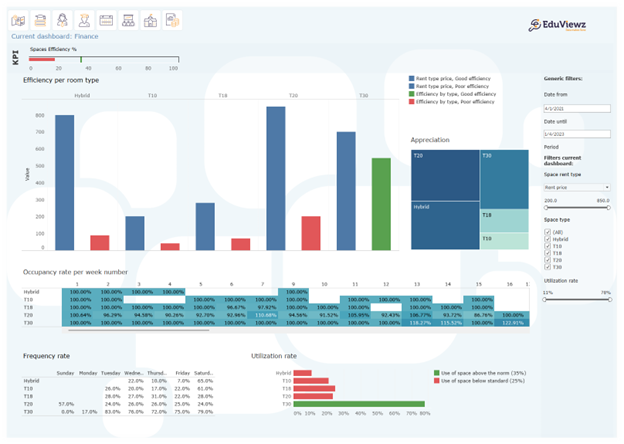
In this article, the Estate dashboard is highlighted.
Appropriate housing is perhaps one of the biggest challenges facing educational institutions. This dashboard shows data on the use of different types of spaces so that there is insight into the current state of affairs. The dashboard also provides tools to help make decisions for the future.
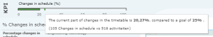
KPI
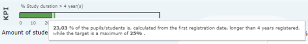
By adding Key Performance Indicators (KPIs) to a dashboard, the end user can immediately see whether the set objectives have been achieved or whether adjustments still need to be made in the process. The set goals and the number of KPIs can be determined by educational institutions themselves.
The KPIs in this dashboard show occupancy rates and actual room utilization.
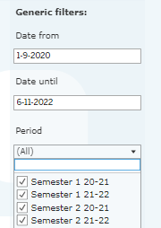
The educational institution can decide which filters to choose. Information shown depends on the data available from the educational institution. Filters that can be included with this dashboard are, buildings, room type, individual rooms, faculty or academy and courses.
![]()
Actual utilization involves dividing the number of students present by the scheduled numbers. This shows that about 70% of the reserved spaces are actually used. In order to use spaces more optimally in the future, an overbooking factor could be used.
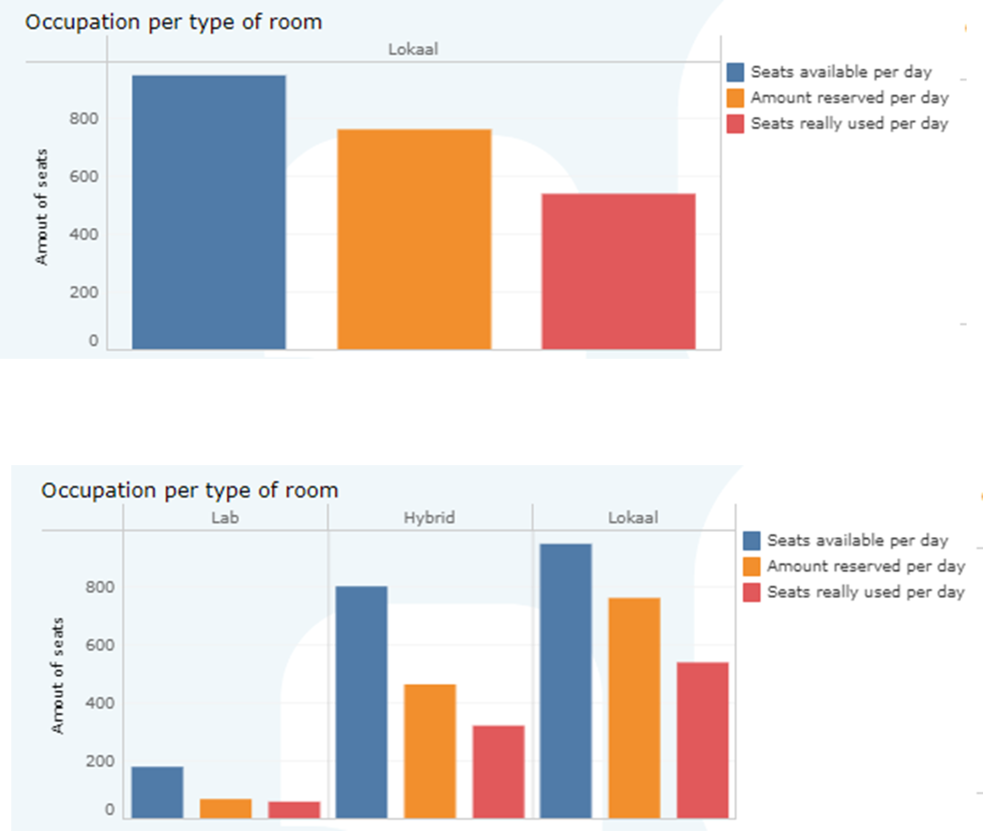
Occupation per type of room
This visual shows three things: the number of available seats per day, the number of reserved seats per day and the number of registered seats per day. The information is displayed by room type. One room type can be chosen, or all available room types can be displayed side by side.
Occupation per room type per lecture hour
This visual distinguishes between the average number of reserved seats per lecture hour during the period in question (light bar) and the actual seats used per day (dark bar).
This visual distinguishes between the average number of reserved seats per lecture hour during the period in question (light bar) and the actual seats used per day (dark bar).
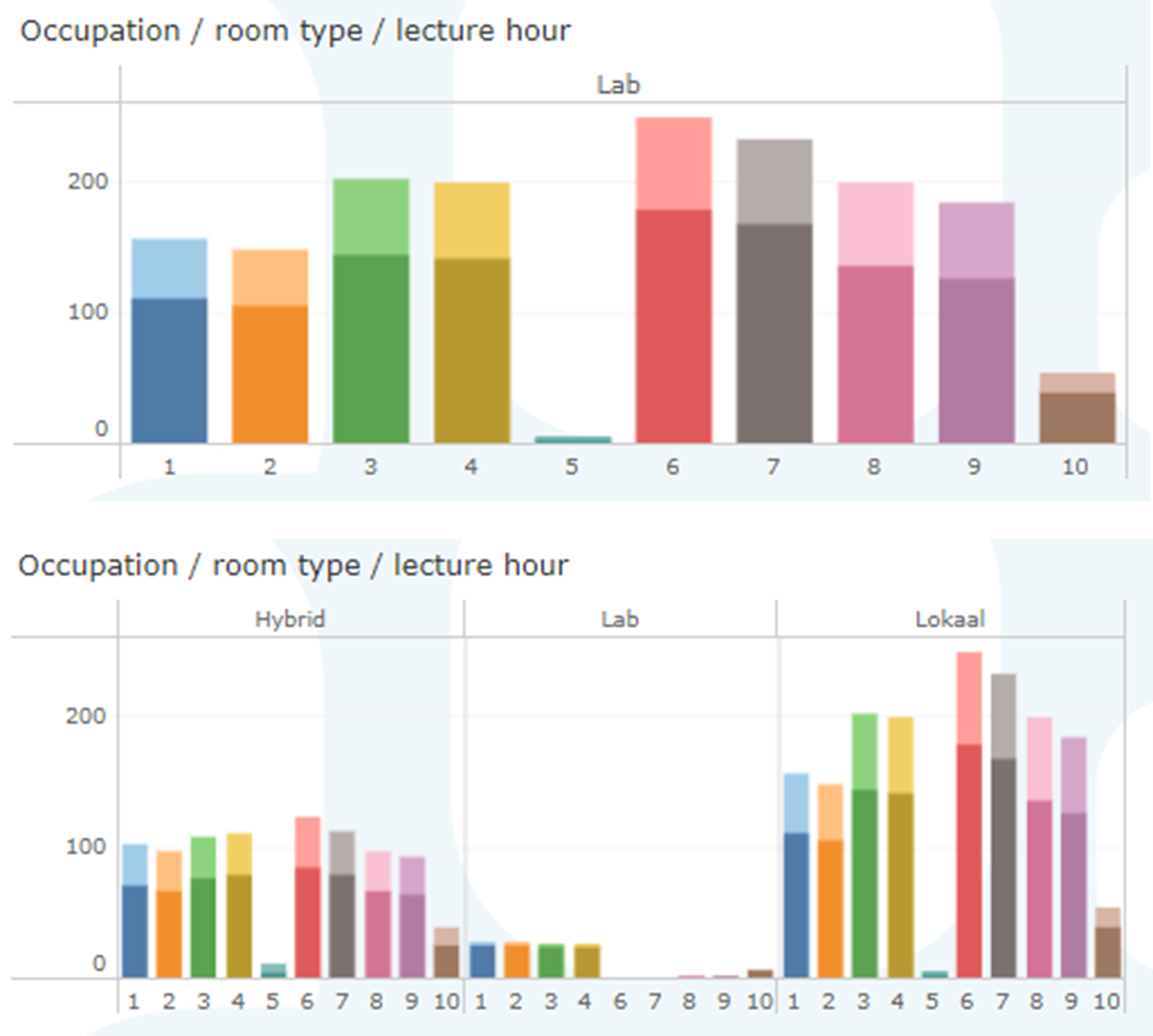
Again, either a single room type or all the different types can be shown.
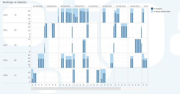
Bookings vs capacity
In this visual, the number of rostered seats and occupied seats are displayed for each room. It also shows the capacity of the room.